Bringing satellite imagery into focus
Yes, but can I see oil tankers?
The digital world is making the physical world more legible. This fact is core to Data Desk’s value proposition. We help organisations see physical processes and systems — like the global trade in oil — that would previously have been hidden to most.
Nowhere is this trend more obvious than with satellite imagery. In recent years, timely, high-resolution satellite images have gone from being the preserve of three-letter agencies in Northern Virginia to commodities that can be bought for as little as $20 apiece.
A stand-out example is SkyFi, a new start-up which provides a consumer-oriented bridge to the historic catalogues and tasking capabilities of commercial imagery providers.


Initiatives like SkyFi are responding to a problem that has been acknowledged for years, and is best set out by Joe Morrison in a now-classic 2020 blog post. In essence, Morrison argues that big satellite imagery companies’ reliance on contracts from governments and the military – particularly the United States Department of Defense – is trapping valuable imagery behind an artificially high cost barrier for commercial and non-profit customers. There are thousands of uses for satellite imagery beyond monitoring the North Korean nuclear programme, and if we fail to ‘use the whole buffalo’ then, as a species, we’re just wasting valuable rocket fuel putting these things in space in the first place.
This isn’t just on the providers, though. Maxar and Planet, the two big dogs of the Earth observation game, both run pro bono programmes where they provide imagery for free or for a reduced fee to non-profits, academics and other public interest groups. Meanwhile, Google Earth Engine offers free cloud-based computing power and an extensive catalogue of pre-processed public imagery from ESA, NASA and others. As an investigative researcher, the difficult bit can be knowing which platform to pick for which job. Do I need 50cm imagery or will 75cm be OK? How many images do I need and over what period?
With that in mind, here’s a quick run-through of the different satellite imagery sources we’ve used in our work to date, giving a practical sense of what each one is useful for.
Maxar SecureWatch

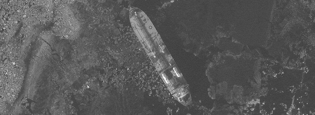
Maxar – formerly known as DigitalGlobe – is the biggest player in the market, and we’ve had great luck with their imagery in the past. Its main advantage is the very high resolution (up to 30cm per pixel), which allows a clear view of large objects like buildings and transport infrastructure. Ships, too, can be clearly identified – and a well-designed catalogue API has allowed us to plug in historical AIS transponder pings to surface images automatically, as with the oil tanker above.
The big downside to Maxar’s approach is that images are only captured relatively infrequently. Unsurprisingly, we’ve found that areas of substantial interest to the U.S. government – e.g. Russian Air Force bases – are treated to regular overflights, while in regions like northern Brazil there can be months or years between captures, making the imagery less useful for change monitoring.

Planet/NICFI
Where regularity is required, Planet is our go-to. We’ve made most extensive use of their data via a collaboration with Norway's International Climate and Forests Initiative (NICFI), which makes a collection of both recent and historical medium-resolution imagery covering tropical regions available for free, largely to support work on deforestation.
Why does it hit the sweet spot for deforestation? While the Planet/NICFI data isn’t as high-resolution as Maxar’s, it has a regular cadence, with new images released on a monthly basis. It also goes through significant pre-processing – most notably, where an image is obscured by clouds, Planet will combine it with other images from nearby dates, creating an artificial ‘mosaic’.
With a guaranteed view of anywhere in the tropics on a monthly basis, researchers can attribute deforestation events precisely, and link them convincingly to the supply chains of large agribusinesses. This is exactly what we did with colleagues at Global Witness, incorporating Planet/NICFI imagery into an internal tool that allowed investigators to quickly make ‘before/after’ comparisons, combined with geospatial data on deforestation and property boundaries from the Brazilian government.
This isn’t even Planet’s main product, though. Where the company really shines is providing daily imagery. The resolution for its most popular imagery, PlanetScope Scene, is comparatively poor – a tenth of what’s available through Maxar – but the frequent updates make it just as valuable. If you can dodge the clouds, 3m/pixel imagery can be useful for all sorts of things, from tracking the progress of large construction projects to following the movements of aircraft and ships around the world – exactly the sort of supply chain forensics work that’s our bread and butter.

The free stuff!
Commercial imagery providers like Maxar and Planet may be the tip of the spear, but they’re comparatively useless when it comes to historical imagery. However much venture capital funding you raise, you can’t launch a satellite into the past. In years gone by, the state did this stuff in-house – and still does.
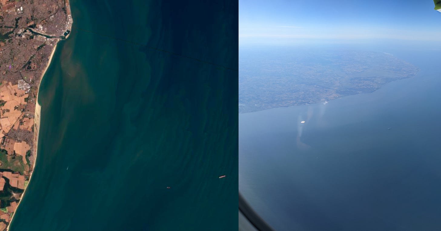
For work on the recent past – anything from 2015 onwards – the best source is the European Space Agency’s (ESA) Sentinel-2 satellite, which offers global imagery at resolutions of up to 10m/pixel on a cadence measured in days rather than weeks. This is generally good enough for large-scale land use change like deforestation and mining – and what’s really powerful is the ease with which you can carry out complex analysis via Google Earth Engine.

This is how we got started looking at illegal rare earth mining in northern Myanmar. To test our initial hypothesis that mining activity was spreading across the border from China, I carried out a series of large-scale NDVI analyses, which use the near-infrared band of the electromagnetic spectrum to highlight areas where vegetation has been lost. We also used Earth Engine’s extensive tooling to analyse the precise colours in the returned images, looking for the distinct turquoise hue of illicit mining pools. This broad analysis with Sentinel-2 data helped us work out exactly the area to include in a tasking mission for high-resolution Planet imagery – working with satellite imagery is often about using one imagery source to more efficiently leverage another.
For anything older than the 2010s, it’s Landsat-7 or bust. Launched in 1999, this old U.S. Geological Survey satellite is definitely showing its age, but its unbeatable catalogue of historic imagery can still be of great use for tracking large-scale deforestation over decades. The Google Earth Timelapse tool is so slick that I tend to use that in the first instance, before consulting the raw imagery.
Beyond the visual
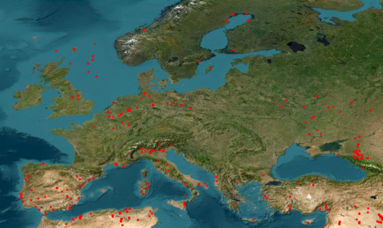
This post has focussed on visual imagery – but that’s only the most obvious piece of the puzzle. In addition to the many hundreds of digital cameras orbiting the Earth, there are satellites carrying synthetic aperture radar (SAR), sensors capable of monitoring atmospheric gases like methane, as well as instruments like NASA’s MODIS, which is used for monitoring fires around the world – including from gas flaring and heavy weaponry used in the ongoing war in Ukraine.

More on all this in a subsequent post. To get an idea of what these techniques can do, check out our latest story, published with The Ferret and on the front page of Sunday’s Glasgow Herald:


